In this project we will be engaging in game design principles for Indie development through
game analysis, paper and digital prototyping. Games are judged not only by the way
they look and sound but importantly by how they ‘feel’. The touch and feel of a game is
one of the most crucial aspects of its design and can make or break a product. This
project focuses on analysis and design for the user experience and asks the question
‘what processes can we use to design games that feel good?’
We will also learn about lean methodologies for development in small studios requires efficient and quick prototyping of game concepts for testing and iteration. Early in the project, guest
speakers from Indie Studios will introduce us to their sometimes unique working
processes.
The Game Concept
For my game I wanted to make something meaningful to me and that I could draw from experiences I have been through so I decided to base my game around the uprising in the Middle East and the effects totalitarian states have on people and the visceral and brutal things that take place in these places.
The experience I had was that I lived in Bahrain for most of my life and 2011 people around the Middle East had started to revolt. Then in February of 2011 Bahrain had it's uprising many riots happened, stories of police men being burnt alive and martial law being inflicted. It was then when my father's company asked us to evacuate Bahrain. I saw tanks cruise down the highways and apart from that it was a ghost town which gave me a sense of unease, as we were trying to get on the highway to make our way to the airport we ran into a checkpoint as they were looking for certain people or anyone who was a Shia Muslim. There was a tank and 4 men armed with assault rifles who ordered my mother (she was driving the car) to roll down her window where she was interrogated then eventually let through and we had a tense 10 minute drive to the airport.
My experience and the events in Bahrain were nothing to the horror and tragedy that is happening in Syria or Egypt or anywhere ruled under an totalitarian dictatorship.
So for my game I want either a family or an individual who has to escape a city ruled under that type of dictatorship, where you experience many of the harsh and brutal things that happen on your endeavour to escape.
I have two ideas for the gameplay style;
1. Have a 2D sidescroller where you play as a family of four and must help each other through the dangerous world where you encounter threats and peril as well as people in the same situation as you and is the tale of how this family cope in such a dark world. You would controller the whole family at once but a certain sections you will need to play as one member of the family to obtain certain items or push certain objects which adds puzzle elements to the game as well.
2. A first person game where you place as a citizen who is trying to get to his family on the outskirts of the city where you only have you wits to help you. Seeing as you are a regular citizen you don't know how to shoot or fight you must run, hide only using certain weapons such as a pipe to stun your pursuers as well as having moments of stealth to make you feel somewhat perilous. The first person view would give quite an intense experience to the game as you are looking through the eyes of the protagonist
Moodboards:
This moodboard was about some of the scenery I would want to explore as well as some scenarios such as sandstorms which I feel could mix up the gameplay. I was imagining the players starting in a warm, homely house when everything starts to go down as that is what happened to me.
Again this moodboard is about possible environments I would like to have the players to experience as I feel these players will show the true chaos and horror that is currently going in these countries.
This moodboard was exploring the sort of theme I want the antagonists to be like, a ruling dictator with his face plastered everywhere with people who blindly follow his order obviously taking inspiration from people like Gaddafi and Kim Jung Il. Also i looked at another environment which is a souk; a very traditional Arabian market place with many narrow and tight corners which would be interesting for a first person view, as well as a 2D one as they usually very bold colours everywhere and many people.
Research of Art Style
For this I am looking at possible styles for my game, each of these examples have parts that I like and would want included in my game. I would ideally want to include aspects from each example such as the mood or the simplicity or the art style. Also I feel that all these styles could portray the tale and tone of game I want to express, as production designer of Pixar, Ricky Nierva said, 'We want to create believable worlds. We want to tell stories. And we want to make the artwork, the look of the film, support that story.' I feel that this applies to my aspirations for my game, as for the sombre tale I wish to tell I feel that the artwork will greatly affect it, that is why I have looked into these varied styles.
Games:
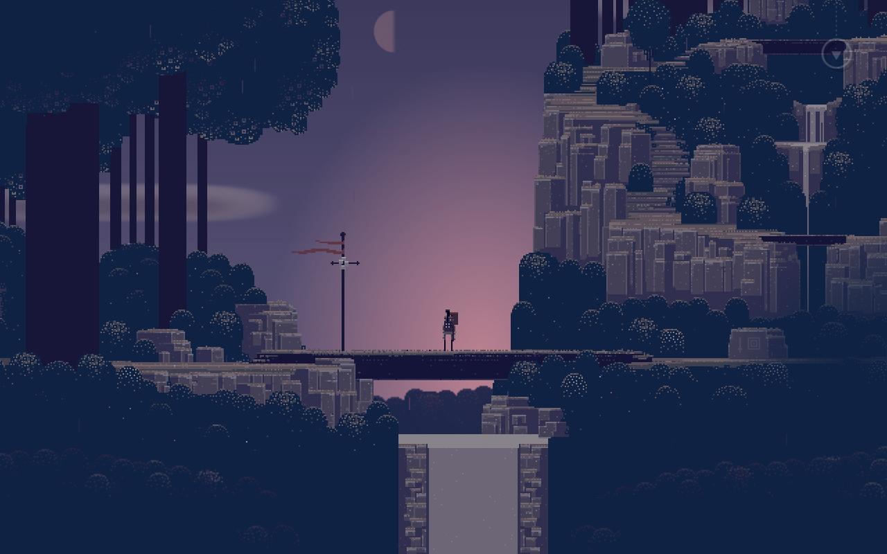
Sword and Sworcery EP
The art style for this game really spoke to me as it is quite simplistic with it's pixelised style yet it coneys such gorgeous landscapes and creates atmosphere with its colour scheme, also the character is very minimalistic focusing all of the attention on the environments rather than the character, which is something I should keep in mind.
Valiant Hearts
The style of this game is quite cartoony yet is able to bring such heart and emotion to the story through it's vivid environments showing what war zones are like as well as it's amazing use of colour to create the tone that they wanted to convey, such as the brown's and grey's of the battlefield and the washed out colours of a destroyed city, also the warm colours of the fires create a striking bright contrast to the usual dulled out colours. These are aspects I would possibly want in my game to establish a broken city.
Limbo
This game is able to create such amazing atmosphere only in grey-scale and due to this very simple style it makes the players to focus completely on the fantastic ambiance, also these dark colours really accentuate the morbid and scary moments in the game.
Guacamelee
While this game is very fun and light-hearted in comparison to some of the games I have. The style is what really drew me to it as it is very clean and colourful and I feel that I could use this style to tell the story of how a cheerful country can turn into such despair, by using these clean art styles but portraying some of the horrific things that happen in these totalitarian countries.
Movies:
UP
This is some of the concept art from the movie UP, this concept work really caught my eye due to the character the environment has, and how they bring across the sense of dread as the pictures go on, which is something I would want implemented in my game which is the art style changes as the game progress as everything is becoming more chaotic and disastrous.
Mr. Peabody & Sherman
The main reason this concept art stood out to me was mainly due to the first picture as I really liked the use of people and items in the foreground as it really adds more depth and could be good to add some dynamic elements to my game. Also like the work from UP I really like the simplicity of everything as it really makes you focus on the key points and not drown everything out.
Persepolis
These are screencaps from the animated movie Persepolis which follows the story of a young girl as she comes to age against the backdrop of the Iranian Revolution. The story itself relates to my game yet I was more interested in the art style of the movie as I really like the choice to have the characters solid colours but the background is a lot more washed out which makes the characters stand out. I also like the way it transitions from characters being detailed to just being silhouettes also by having the army official being silhouettes but the eyes are highlighted gives them quite an ominous feeling.
Artists:
Yao Yao
In my research for art styles I also looked at artists themselves such as Yao Yao who created some amazing work which looks like it could be a game, the reason this stood out to me was due to the sense of depth he achieved as well as the emotion each image shows due to the choice of colours.
Benjamin Fedosky
I also looked at traditional artists because I think it would be interesting to have a game that looks like a traditional painting. The reason the work of Fedosky resonated with me was because I liked the chaotic brush strokes and that sense of dread it achieves. I also feel that I could somehow transition from a cleaner style to this more riotous one.
Don Bolognese
This style is slightly more structured, but that is not what drew me to it, the thing that did was the use of ink. In my head I can envision there being a white canvas and as the characters move forward the pathway is splatted in front of them think 2D Unfished swan. Explosions and gun muzzle flashes would be splats of ink as well.
Characters
For my main characters I really want them to be a relatable family, as this will be important as the players need to be able to get invested in them so that the would want to go on this journey with them, and I feel the look of that family will have a big part in that. My idea for the family is to not have them native to the country I will set the game in, I want them to be expatriates, like I was in Bahrain, which should add some tension to the game as they will be more at risk being outcasts.
Again I looked at multiple types of styles to try and find one that would be suitable for what I want to create. I know that the characters have to be able to fit in the art style I chose but I don't know if the characters should dictate what the style is or the environment should as they are both integral to the tale I wish to tell and both need to be able to resonate the tone of the game as well.
For these pixel characters shape and colour was very important to me when I was creating them as I needed them to each be easily recognisable especially the main characters as I didn't want them to get lost as playing as 4 characters is already quite overwhelming
Father Variants
The skill the Father have will be to move heavy objects such as crates to access areas up high, He can also store pick-ups in his backpack. I wanted my dad to seem like a middle age man so I felt that the beer belly really portrayed that, also I added the goatee as my father has one so I drew from what I know.
Mother Variants
The Mother will have the ability to heal herself and the rest of the family she can also boost people up to areas up high. For the mother I wanted her to feel like a housewife / soccer mum so I looked at Claire from Modern Family and the mum in Toy Story for reference of the type of clothing as I feel that is the most important thing to make someone feel motherly.
Older Brother Variants
The Older Brother has the skill of being good with technology so he will be able to disable spotlights, or hot-wire cars even pick-lock doors. To show that he is quite tech-savy I made him carry around a laptop bag as he'd always want his gadgets on him. I took a lot of inspiration from my own brother for this character such as the clothes my brother wears and the glasses which also added to the geek vibe.
Younger Brother Variants
The Younger Brother will have the skill of getting through tight spots such as, cracks in walls to get around a locked door, or crawl through vents to collect important items, so I needed him to be substantially smaller than the rest of the family to make this seem plausible. I feel that the use of shorts and socks makes him seem much younger as it makes him seem more playful as well as the graphic t-shirts.
The Family
For the family I wanted a consistent colour scheme and a varied body type and hair style so that even their silhouettes could be easily distinguished. For the colour scheme; the father and older brother have the same colour hair and backpacks, the mother and young brother also have the same colour hair. Everyone is wearing white in some manner, the blue on the father's t-shirt is the same as the blue of the younger brother's shorts and the older brother has the same shade of blue as the mother's jeans. I wanted all these colours to be the same, and each character to share them so that they all fit together and feel like they are a team. The reason the Mother is wearing pink is to further stand out as she has the very important skill of healing so she needs to be extremely recognisable
Rebel Faction Variants
The Rebel Faction needed to stand out against the opposing force of the Police and the Military. I also wanted their colour scheme to scream activists and protesters, so I went with a red, black and white colour palette. I made their clothing look quite rugged and torn to add to the fact that they are struggling and fighting back. I made them have quite basic weapons such as molotov's and bats with nails in them, to show they have to use anything as a weapon.
Riot Police
For the riot police I looked at the actual uniform that the police wear in Bahrain and this is the results.
I wanted a variety so that there would be a full unit ranging from the shield, baton, tear gas and the commanding officer. I tried to make each type of police officer have a different shape so you would be able to easily distinguish each one quickly.
Military
For the military I went in with the same concept I had for the Police where I wanted there to be a variety of them, also to have their shapes to be distinguishable.
The Dictator
For the Dictator I made him shorter than the rest of the adult males as well as quite a bit fatter as I wanted him to feel like a greedy person.
Environments
Here, sticking with the pixel art style I created some environments that you could potentially come across in the game. I really tried to make the environments feel like an Arabian country, I also made posters and billboards that would be scattered throughout the environments as I was trying to add a sense of realism and really create a world with it's own back-story
This is a scene that would be somewhat early in the game, I used palm trees as they are the predominate type of tree species that grow in these areas. For the mosque I based it off the Al-Fateh Grand Mosque in Bahrain (shown below)
I really wanted the colour scheme and basic pattern to be shown on my mosque as I wanted to allude that this was the mosque in the game. As you can see I used the same pattern layout on the archway and along the roof and I tried to keep the structures of the minarets as close as I could using pixels

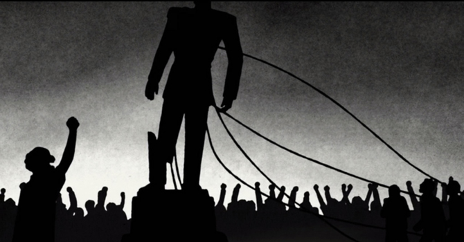
This is one of the posters you will see plastered around everywhere. This is a propaganda poster the the Dictator has had commissioned. I used the work of Shepard Fairey (Graphic Designer / Street Artist) as a major source of influence of my work and the propaganda work in North Korea and Soviet Russia. The colours of my poster where taken from those used in Fairey's work as it's very bold and striking and automatically screams power and dominance. I put a large head of the Dictator in the middle as he considers himself the center of the universe with his soldiers below him showing that he controls them. Also the use of bullet holes was to contextualise this poster to make it fit the environment of a war torn country.
Below are examples or Fairey's work and real propaganda posters that influenced me in my design:
Shepard Fairey
North Korea Propaganda
Soviet Russia Propaganda
Propaganda Billboard
The Billboard in a possible environment
Narrative:
(to come later)
Name of my Game:
Throughout the process of designing my game I was constantly trying to think of a name of my game that had meaning and somehow kept with the theme of my game. I finally decided on - The Pearl of the Desert - The reason I decided this as the name is because there was a very famous roundabout in Bahrain called the Pearl Roundabout (shown below)
As you can see it's quite a beautiful monument on the roundabout, which was erected in 1982 making it an iconic symbol of Bahrain. The reason it was made was to commemorate the third summit of the Gulf Cooperation Council. The Pearl Monument consisted of six dhow "sails" projecting up to the sky, which came together to hold a pearl at the top. The six sails designated the Gulf Cooperation Council's six member nations, while the pearl symbolized their united heritage and the country's famous history of pearl cultivation.
But during the uprising in 2011 the roundabout was main site of the demonstrations much like the Tahrir Square in Cario. There was a police crackdown on this site where many people were injured and up to 4 people were killed. After these events the Bahrain Defence Force occupied the area with tanks, to stop demonstrators re-occupying the area and any who got close where shot with rubber bullets by the Defence Force. Shortly after that the Crown Prince of Bahrain allowed the protesters to peacefully occupy the area and where guaranteed to demonstrate without any further attacks in an attempt to calm both parties.
However on March 16th 2011 roughly a month after the demonstrators occupied the area and after the guarantee was said the area was evacuated, bulldozed and set on fire by the Defence Force, Riot Police and the Peninsula Shield Force (shown below)
It doesn't end there. After the horrible destruction of this beautiful monument and something I grew up with for most of my life, the government announced it would be replaced with traffic lights. they also renamed the area as Al Farooq Junction, a reference to Umar ibn al-Khattab, a historical figure revered by Sunnis and considered by Shiites (the demonstrators) to be against their cause. As of 15 July 2014, Al Farooq Junction has never been opened to the public. The area has been sealed off by security forces since protesters were cleared from the Pearl Roundabout on 16 March 2011.
As you can see they have replace a stunning monument with a bland and sterile junction. In another attempt to wipe the Pearl roundabout from Bahrain, The Central Bank of Bahrain asked all banks to exchange their half dinar coins which featured the Pearl Roundabout on it with the half dinar note which features the control tower of the Grand Prix Track (a much less iconic structure) both are shown below:
All this just shows to what length's a totalitarian country will go to in an attempt to hide any attempt to anyone standing up to them and challenge their power.
Game Cover Concept
For my cover art I wanted it to be reminiscent of old movies posters, as that is where I got most of my inspiration from. I feel that movie posters can portray the tone and theme of the movie very effectively and that is what I tried to achieve with my cover.
Game Cover
Poster for Game
The Main Influence:
This is the cover for volume one of The Walking Dead comic which really resonated with me as the imagery clearly shows a family that has been broken by the events taken place in the narrative.
Movie Posters That Influenced Me:
Feedback for my Prototype:
Connor Carter:
Sam really
like your prototype, conveys your art style perfectly in game strengthening the
approach you took and that it can be a successful one. The prototype really
demonstrates the core mechanics of gameplay that will be used throughout your
game and all function and feel natural when playing!
Will Barrett:
Sam your
prototype works really well, apart from the dad can push the box under the
platform
Iteration:
The way I iterated on my prototype was at first the 3 playable characters where essentially all the same except for their height. I changed the jump height and run speed on all the characters so that the dad is slower but can jump relatively high, the older brother is slightly faster than the dad and can jump the same height as him, and the younger brother is really quick but can't jump that high.
Feedback of my GDD:
Connor Carter:
Extremely strong artwork visual that really
convey and create a feel for the game world. The creation of other mediums such
as propaganda posters and game covers really adds to the story
telling of the game and its immersion.
Strong narrative that creates a very
personal connection the player and the thorns as they feel that the lives of
the family are completely in their hands. Good motivation.
Really good historical contextual ground,
thoroughly research and iterated.
Good range of character visual which aid in
variation throughout levels.
The character changing mechanics adds a
really interesting gameplay style to the game and require the player to think
deeper into approaching a situation instead of charged head long into it.
Really like the environment hazard aspect
for the level mechanics. Find that it shows clear definition of progression and
yet another aspect for the player to consider. Wondering if the environmental
hazards apply to enemy movement and interaction as well as the thorn families?
Clearly conveyed and concise document that
give more than an adequate amount of information for me the player to want to
play the game for myself. Easy to read good choice of font and layout. However I
would maybe think about change the shade of creamy yellow you use in your
presentation to a slightly darker shade as it can be a bit bright and difficult
to read the text on it. Apart from that amazing game and GDD!
Iteration:
I changed the font to something much more readable but still stuck with my Arabian theme I also changed the layout of the user interface page so that it flowed much better and was easier to follow
Life Drawing:
Silhouette studies 3 minutes each
Line drawing
Vertical lines only - graphite and eraser -
Horizontal lines only - graphite and eraser -
Rendering with and eraser - added shadows with graphite -


.jpg)